Neutral Colour
Facechart
I love designing neutral facecharts
because this is the style and colour make-up I would choose to wear
myself. I feel it suite my skin tone and
bone structure as it highlights angles of my face.
I created a gradient across the
eyelids by adding tints of lighter browns in the corner and darker tints
towards the edge of the eye. This gives
a great effect on the eye and looks prettier than one standard block
colour. It also shows experimentation of
different shades and tints of one colour.
This is probably my favourite design
out of the four because I think it’s simple yet elegant. It’s the sort of make-up you could wear to a
wedding and look fabulous without going over the top with colour.
Complimentary Colour
Facechart
When designing my complimentary
colour facechart, I wanted to show use of block colour rather than shades and
tints because I felt if I was to wear bold colours I would want them to be a
statement rather than a soft touch on the face.
I chose the colours red and green because I think they are the most
striking colours on the colour wheel.
I do think these colours go well
together as they are complimentary and they make a bold statement. However, I think they would look great for a
catwalk show because they will be able to be seen from a distance.
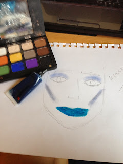
Monochromatic Colour
Facechart
A monochromatic colour is using the
tint, tone and shade of one colour. I chose
to use blue as it is my favourite colour and I love all of the shades you can
create with it. A tint is a colour with
white added. A tone is a colour with grey
added. A shade is a colour with black
added.
I chose to do a tint on the eyes as I
wanted to create a gradient effect down the features of the face. Therefore I chose to use a tone on the cheeks
and a shade on the lips. I feel this
worked quite well as the facechart did not look like I used the same block
colour over the whole face.
I think this look would look amazing
for a photoshoot as it would show off the skills of a make-up artist because
each section of the face has a different effect which has to be perfect.
Analogous Colour Facecharts
Analogous colours are colours that
are adjacent to each other on the colour wheel.
However this only applies to more than two colours but less than 5. I chose to use the colours yellow,
yellow-orange and orange because I was going for an autumn theme. As the colours are so close on the colour
wheel, I think they blend nicely and complement each other on the face.
I wanted this look to stand out so I
went for a different coloured eyebrow look and a two toned lip. This make-up design would obviously not be
worn day to day as it is too extreme, but I think it would be great for a new
make-up brand promoting their products. They
could show off how versatile they are and how you can create cool, funky looks.


No comments:
Post a Comment