Saturday, 30 November 2013

Chosen face chart and practise onself

This is my chosen final facechart.  I chose this one for a number of reasons.  Mainly because it was the best option to go with my hairstyle and it tested some of the new techniques we had learnt.  The picture above is the practise I did on myself of my design.  I feel it went well and I thought it was simple enough for someone else to create on me.  I think the shaping of the lipstick and eyeshadow suited my face shape and bone structure which is important in designing make-up.

The traditional elements are the pale skin, blocked out eyebrows and eyelashes and the shape of the blusher.  Although the colours are traditional, I still feel this design is regal and elegant.  Especially with the design paired with the hair I think the two together will look great.

Presenting final charts

Below is my feedback from presenting my facecharts.
 
I have done a few presentations before so I wasn't too nervous about presenting to the class.  I had prepared a short powerpoint at home and had decided to give out the hard copies of my facecharts around the class.  I feel this engages with the class and shows that I am comfortable in communicating with them.
 
Although my powerpoint presentation was quite short, I feel I gave the class the vital information about my facecharts.  Next time I would go more in depth into the research behind my designs, this will give the audience a better understanding of my creations.


Final instructions


FINAL MAKE-UP INSTRUCTIONS

Equipment

·         White Illamasqua Foundation – RF100

·         Satin Primer

·         Loose Powder

·         Screenface eyeshadow palette

·         Illamasqua Liquid Metal Palette

·         Blue and Red Lipmix

·         Powder brush

·         Foundation brush

·         Blending brush

·         Eyeshadow brush

·         Lip brush

·         Mascara wand

Method

1.      After cleansing, toning and moisturising the skin, mix the foundation and primer together on the back of your hand.  Then apply it onto the skin using the foundation brush.

2.      Once the foundation is applied all of the face, buff it in with a blending brush to give it an even finish.

3.      Next, using a powder brush, apply the loose powder all over the face.

4.      Using the eyeshadow brush, apply the bright yellow colour from the Screenface palette all over the eyelids.

5.      Using the same brush, apply ‘Electrum’ from the Illamsqua Liquid Metal palette over the top of the yellow.

6.      Take a mascara wand and use the white foundation to block out the eyelashes and eyebrows.

7.      With the powder brush, use the purple from the Screenface palette and apply it to the apples of the cheeks.

8.      Lastly, mix some blue and red lipmix together until you have a deep purple.  Then apply this all over the lips using the lipbrush.

Friday, 29 November 2013

Practise of my Design by Emily

I feel this practise went well.  The foundation was a bit dry but that can be changed by using more moisturiser before hand.

If I was to change anything it would be the lips.  I would make them slightly smaller and in less of a point at the cupids bow.  Other than that, I think Emily did great at practising my design.  We worked well together and communicated professionally.

Thursday, 28 November 2013

Paul Hodgson

PAUL HODGSON
 
 
Paul Hodgson. (). Paul Hodgson. Available: http://www.marlboroughfineart.com/artist-Paul-Hodgson-120.html. Last accessed 27th Nov 2013.
 
I came across the picture above of a Geisha and it instantly reminded me of the Elizabethans.  The pale skin, beautiful outfits and accessories, I felt it was a perfect comparison.


Paul Hodgson. (). Paul Hodgson. Available: http://www.marlboroughfineart.com/artist-Paul-Hodgson-120.html. Last accessed 27th Nov 2013.
 
I chose to look at this picture above because the gentleman’s expression looks scared.  This is what I think Queen Elizabeth felt like inside, she became very well known at a young age which must’ve been scary.  However, I think she hid this persona and put on a front to the country.


Wednesday, 27 November 2013

Lip tricks

Lip Trips
      The Lip Trip I decided to try out was using lip liner to make the top lip look plumper and larger.  I knew you could do this trick, I just wasn’t sure how to do it without making the client look too over the top.  Therefore I was excited to learn this technique properly so I can use it in the future.
      I took a dark brown lip liner and sharpened it into a point.  I then slowly started drawing on the natural lip line on the top lip and not taking the pencil off the skin.  When I got to the cupids bow, I went over the lip ever so slightly to give it some height, I then repeated this to the other side of the lip.
      When I got to the middle, I had to join the cupids bow so it looked even, to do this, I turned my model towards me so we were facing each other.  By stepping away you can see where you have gone wrong or where you would like to retouch.  I then filled in the whole lip using a similar colour and blended it in to the lip liner.
      Below is my creation of a lip trick.  I am very happy with the outcome and it is a technique I will definitely be using in the future.


Friday, 22 November 2013

Final face charts

 The facechart above was my first design I chose for an option for my final design.  I gathered my ideas from the picture below taken from Chanel.  It's almost the opposite of the traditional Elizabethan make-up where they have no make-up on their eyes, I decided to go to the extreme and use black.  However I am still keeping the traditional pale lips and skin.

Rachel Adler. (2012). Chanel Pre-Fall 2013 Took Hair to New Heights. Available: http://beautyhigh.com/chanel-prefall-2013-hair-heights/. Last accessed 25th Oct 2013.


 This facechart above was inspired by Cate Blanchett who played Elizabeth in Elizabeth: The Golden Age.  Her make-up was very natural and almost hardly there.  So I decided to put a contemporary spin on it and make the make-up stronger.  I kept with the natural shades of make-up I just applied them a bit heavier.  However, I still feel I could design something a bit more exciting.

Melissa Michaels. (2008). Oscars 2008: Cate Blanchett Doubles Down on Her Lucky Number Two. Available: http://www.hollywoodtoday.net/2008/02/22/oscars-2008-cate-blanchett-doubles-down-on-her-lucky-number-two/. Last accessed 25th Oct 2013.


This facechart is my favourite out of the three, it seems the most exciting and regal.  The colour purple is most certainly a royal colour, and the gold I have used on the eyes give is the perfect balance.  Purple and yellow are also complementary colours so this also played a big part in creating my design.  I wanted to chose colours that went well together rather than bland neutrals.  As you have seen from my other blogpost I have done some research into furnishings that are purple and gold.  these were big inspirations to me, as I wanted to create something beautiful like those designers had.

Wednesday, 20 November 2013

Contemporary Elizabethan Look - Maddie


Contemporary Elizabethan Look
 

Equipment

·         White Illamasqua foundation – RF 100

·         Mate Primer

·         Illamasqua bronzer – Disobey

·         Lip Palette

·         Loose translucent powder

·         Foundation brush

·         Blending brush

·         Rounded eyeshadow brush

·         Powder brush

·         Lip brush

·         Spatulas

REMEMBER TO ALWAYS WASH YOUR HANDS BEFORE TOUCHING SOMEBODY ELSE’S FACE AND ALWAYS KEEP HAND SANITIZER NEAR BY.


Method

1.      Firstly, I mixed some of the white foundation with the primer to give it a better coverage and to thin it out.  I then applied this to the face with a foundation brush, taking extra care to make it even across the skin.

2.      Next, I used a blending brush to buff the foundation into the skin, which gives a great finish.  I also made sure I went over the lips to give an extra pale look.

3.      Then I scraped some bronzer out of the palette onto my hand.  Using the same brush, I applied it to the apples of the cheeks in a small, round, circular motion.  This gave a nice warm glow.

4.      I then applied loose translucent powder all over the face using a powder brush making sure then end result was smooth and not sticky.


5.      Next, I scraped some bronzer out of the palette onto my hand and then using the rounded eyeshadow brush I slowly blended the colour onto the eyelids creating a nice round shape.


6.      Lastly, using a spatula, I scraped some peachy lipstick out of the lip palette and put it on the back of my hand.  I then used the lip brush to apply the product all over the lips ensuring I stayed within the natural line.

Below is my creation of this look
            I really enjoyed creating this look as my models skin was perfect for this look, the foundation blended in nicely which I was pleased about.  I feel I blended the eyeshadow to suit my models eye shape.  If I was to do this look again I would look into investing a lip liner of a similar colour so I can get the lips sharp and neat.


Practise of Emily's design


Practising Emily’s Design
      I feel I am more comfortable with make-up than hair, so when I received the facechart I was creating I got extra excited.  I think her design was beautiful and elegant and I couldn’t wait to try it out.
      For my first practise I thought I went great and I felt like I didn’t need to practise again.  I feel my greatest achievement when creating this design was blocking out the eyebrows. As Emily has dark hair I knew this would be a challenge for me, however, it took some time but after a lot of patience I was happy with the outcome.
      I was also happy with the lips as I had to make Emily’s plumper at the top using lip liner.  I had only practised this once before so I was nervous about doing it for the second time.  I feel on this second practise they looked neat and even.  I also blended the lipstick well with the liner.
      For my final assessment the only thing I would do differently is use some more moisturiser before applying the make-up.  I would do this because the foundation I used is very dry and sticks in some places on the skin.  Using more moisturiser will help the foundation glide on smoother and give a cleaner finish.

Monday, 18 November 2013

Traditional Elizabethan - Laila


Traditional Elizabethan Look

Equipment

·         White Illamasqua foundation  - RF100

·         Mate Primer

·         Loose translucent powder

·         Illamasqua blusher – Tremble

·         Mascara wand

·         Powder brush

·         Foundation brush

·         Blending brush

·         Spatula

REMEMBER TO ALWAYS WASH YOUR HANDS BEFORE TOUCHING SOMEBODY ELSE’S FACE AND ALWAYS KEEP HAND SANITIZER NEAR BY.


Method

1.      Firstly, I mixed some of the white foundation with the primer to give it a better coverage and to thin it out.  I then applied this to the face with a foundation brush, taking extra care to make it even across the skin.

2.      Next, I used a blending brush to buff the foundation into the skin, which gives a great finish.  I also made sure I went over the lips to give an extra pale look.

3.      Then I scraped some blusher out of the palette onto my hand.  Using the same brush, I applied it to the apples of the cheeks in a small, round, circular motion.  This gave a nice rosy glow.

4.      Next, I used a mascara wand to apply the same white foundation to the eyelashes.  This blocks the eyelashes out and also gives a really good affect.  I also did this to the eyebrows as the Elizabethans shaved their eyebrows off and plucked their eyelashes out.

5.      Lastly, using a powder brush, I applied loose translucent powder all over the face making sure then end result was smooth and not sticky.

Below is my picture of the created look

            I found this look particularly difficult to create as the foundation is very dry on the skin even after moisturising and using primer.  I also feel I could’ve blocked the eyebrows out more as the model I chose has darker hair therefore they are more noticeable.  Other than that, I feel I did well at blending the foundation to the edge of the hairline and into all the creases in the skin.

Wednesday, 13 November 2013

Paperself Inspired Facecharts

My first design inspired by Paperself is a traditional neutral make-up.  As I have mentioned in other blogposts, this is the kind of make-up I enjoy wearing.  By adding the Paperself lashes, it gives the design a bit of flavour and elegance.  The simple swirly lashes jazz up the neautral make-up and make the overall look exciting.
I wanted to go for a firey design for my second idea and keep it an autumn theme.  I decided to place the eyelashes on the lips instead of the eyes to make the design different and unique.  I have extended the lip line with black eyeliner, and only stuck the end of the lashes on.  This design to me looks very much like the Joker from The Dark Knight.

Dan Jolin. (2009). The Making of The Joker. Available: http://www.empireonline.com/features/heath-ledger-joker. Last accessed 12th Nov 2013.

Paperself


This is a picture of my practical using Paperself lashes.  I really enjoyed working with Paperself and would definitely use them again.  They were quite fiddly but after I had handled them a bit more I felt comfortable about applying them.  I gently cut them to the correct size and added a tiny bit of duo eyelash glue.  As I wear falsh eyelashes quite a lot I am used to applying them in the correct place and getting them as close to the lash line as possible.

I am really happy with the out come of these eyelashes on Emily, with the natural make-up I think they look beautiful.  They add something extra to a make-up design and make it more interesting to look at.  I would use the lashes on a photo shoot.

Tuesday, 12 November 2013

Facecharts - Colour wheel


Neutral Colour Facechart

            I love designing neutral facecharts because this is the style and colour make-up I would choose to wear myself.  I feel it suite my skin tone and bone structure as it highlights angles of my face.
            I created a gradient across the eyelids by adding tints of lighter browns in the corner and darker tints towards the edge of the eye.  This gives a great effect on the eye and looks prettier than one standard block colour.  It also shows experimentation of different shades and tints of one colour.
            This is probably my favourite design out of the four because I think it’s simple yet elegant.  It’s the sort of make-up you could wear to a wedding and look fabulous without going over the top with colour.


Complimentary Colour Facechart

            When designing my complimentary colour facechart, I wanted to show use of block colour rather than shades and tints because I felt if I was to wear bold colours I would want them to be a statement rather than a soft touch on the face.  I chose the colours red and green because I think they are the most striking colours on the colour wheel.
            I do think these colours go well together as they are complimentary and they make a bold statement.  However, I think they would look great for a catwalk show because they will be able to be seen from a distance.


Monochromatic Colour Facechart

            A monochromatic colour is using the tint, tone and shade of one colour.  I chose to use blue as it is my favourite colour and I love all of the shades you can create with it.  A tint is a colour with white added.  A tone is a colour with grey added.  A shade is a colour with black added.
            I chose to do a tint on the eyes as I wanted to create a gradient effect down the features of the face.  Therefore I chose to use a tone on the cheeks and a shade on the lips.  I feel this worked quite well as the facechart did not look like I used the same block colour over the whole face.
            I think this look would look amazing for a photoshoot as it would show off the skills of a make-up artist because each section of the face has a different effect which has to be perfect.


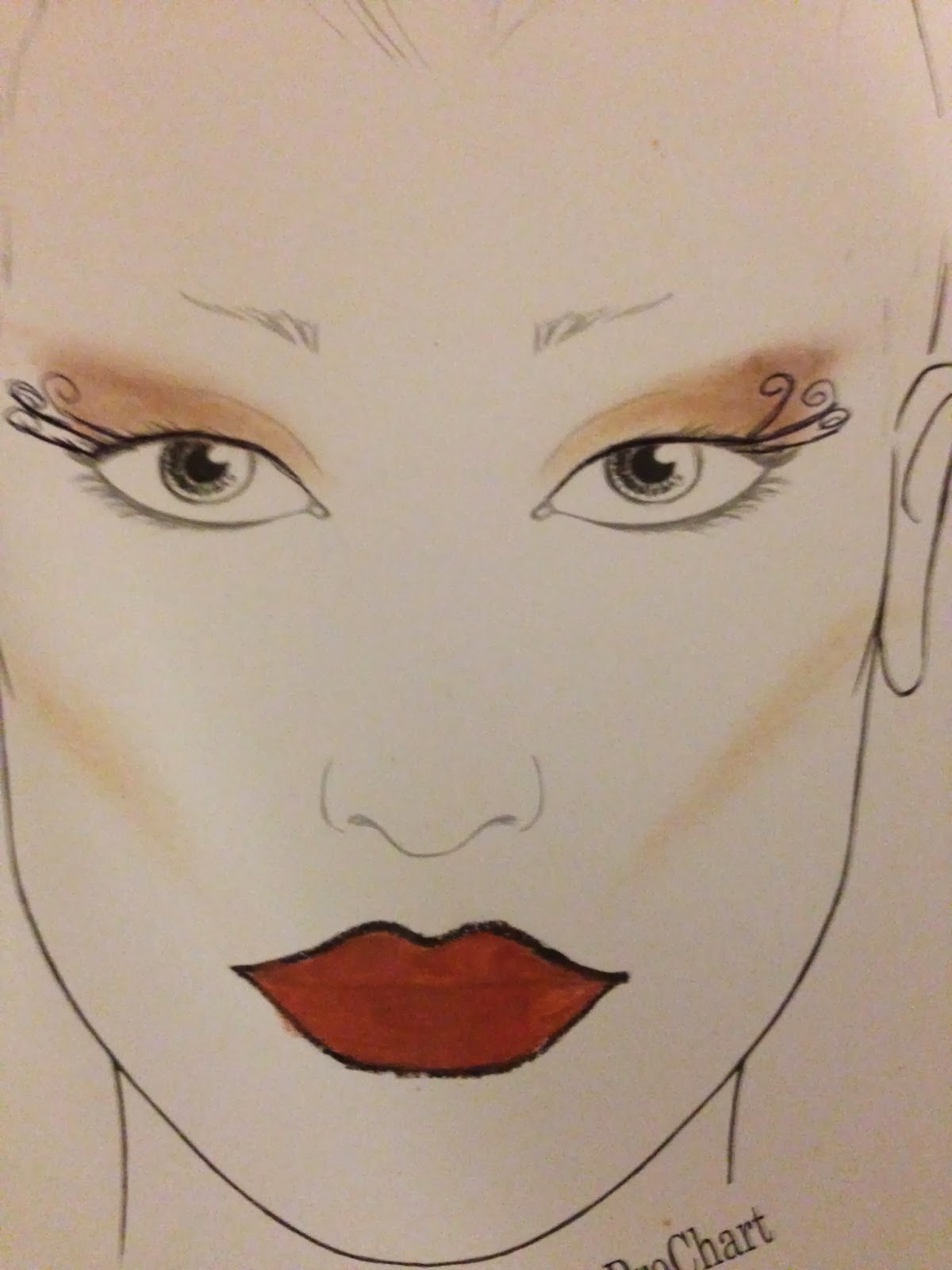
Analogous Colour Facecharts

            Analogous colours are colours that are adjacent to each other on the colour wheel.  However this only applies to more than two colours but less than 5.  I chose to use the colours yellow, yellow-orange and orange because I was going for an autumn theme.  As the colours are so close on the colour wheel, I think they blend nicely and complement each other on the face.
            I wanted this look to stand out so I went for a different coloured eyebrow look and a two toned lip.  This make-up design would obviously not be worn day to day as it is too extreme, but I think it would be great for a new make-up brand promoting their products.  They could show off how versatile they are and how you can create cool, funky looks.


Eyes and Lips

Eyes and Lips
Equipment
 
·         A pre ready foundation and contoured face.
·         Screenface eyeshadow palette
·         Mascara
·         Mascara wand
·         Lipstick palette
·         Lip liner
·         Rounded brush
·         Blending brush 
·         Lip brush 
·         Spatulas 
 
REMEMBER TO ALWAYS WASH YOUR HANDS BEFORE TOUCHING SOMEBODY ELSE’S FACE AND ALWAYS KEEP HAND SANITIZER NEAR BY.
 
Method – Eyes
 
1.      I like to leave lips until last so I started with the eyes first. Again, always start with the lighter colour so the darker colour doesn't make the lighter colour look muggy.
 
2.      Firstly I scraped some of the product that I wanted to use out the palette and tipped it onto the back of my hand.  Then using a small rounded brush, I applied a light brown to the corners of the eyes and blend out across the eyelid. Apply this to both eyelids - this is your base colour. 
 
3.      Next I chose a slightly darker brown scraped that out of the palette and started halfway across the eyelid and brought it to the edge of the eye. I like the way this creates a gradient effect.  I feel it gives a great smokey eye look.
 
4.      Lastly, I chose a dark brown to apply into the crease of the eyelid. This defines the eyelid and creates a moody look. I scraped this colour out of the palette and brought this colour out to a winged look as I felt this shape would've suited this eye shape of my model.

5.      Next I moved onto mascara.  I cut the end of the original mascara wand off so that I was not tempted to use this on my model.  It is important to have disposable mascara wands as there are many germs that can be transferred from eyes.  I used a disposable mascara wand and dipped it into the mascara once.  I asked my model to look straight forward and slowly applied the mascara.  I also asked her to blink as this helped apply the mascara.
Method – Lips
1.      Firstly I made sure I had a sharpened lip pencil as a point is perfect to create a near line.  I then started with the corner of the top lip and made small movements across the edge of the lip to outline it. 

2.      Then, I repeat this all over edge of the lip and then used the lip pencil to colour the lip in to give it a base colour before the lipstick is applied. 
 
3.      Next, use a lipstick that pretty much matches the colour of the lip pencil and use a brush to fill in the lip. Be sure to blend it into the lip liner so it doesn't look too prominent.  I chose to use red in this instance as I felt it went well with my chosen eyeshadow colours.
Below are my creations of eyes and lips
            I really enjoyed creating this look as I love blending eyeshadows and creating looks to suit other people.  If I was to create this look again I would maybe go over the natural lip line to give a plumper lip.  Other than that I’m very happy with my overall look.